Studio Apartment Layout Ideas: Zoning One Room Into Five Functions
The average U.S. studio runs somewhere between 400 and 600 square feet, and most of that footage has to do the job of a one-bedroom apartment’s entire floor plan. You’re not just decorating a room. You’re fitting five rooms’ worth of function into one, without a landlord who will ever let you put up drywall. That’s a layout problem before it’s a decorating problem, and it’s worth treating it that way.
The good news is that people have been solving this exact puzzle in New York, Chicago, and San Francisco micro-units for decades, and the tools that work are cheap and completely renter-safe: rugs, curtain rods, furniture orientation, and lamps. No landlord approval required for any of it.
Start with traffic flow, not furniture
Before you place a single piece of furniture, walk the room the way you actually move through it in a day. From the front door to the kitchen. From the bed to the bathroom. From the couch to the desk. Whatever path emerges is your circulation route, and it needs to stay clear and roughly 30 inches wide at minimum, closer to 36 if you can manage it. Every zone you build gets arranged around that path, not on top of it.
This is the step most people skip, and it’s why so many studios feel like an obstacle course even when the furniture itself is fine. A coffee table that’s technically not in anyone’s way when the room is empty becomes a shin-bruiser the moment you’re carrying laundry through it at 7am. Map the walk first. Zone second.
Give the bed a visual edge, not just a corner
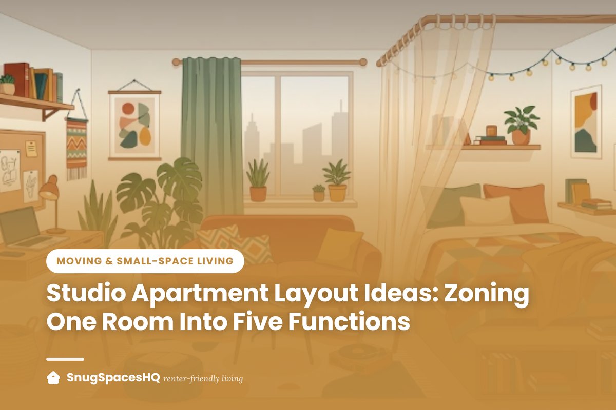
Pushing the bed into a corner is the standard move, and it’s a reasonable one, but the corner alone doesn’t separate the bed from the rest of your life. You still see it, and your brain still registers “bedroom” the second you walk in the door. What actually creates separation is a vertical element between the bed and the living area: an open bookshelf, a curtain track, or a slim console table turned perpendicular to the wall so its back faces the bed. A tension curtain rod mounted between two walls, or a ceiling-mounted track rod if your lease allows it, lets you hang a floor-length curtain that closes off the sleep zone visually and cuts down on light from the living area if you’re a light sleeper. IKEA’s tension rods and curtain tracks are the go-to for renters because they require zero drilling. A tall open bookcase does something similar without fully closing the space off, and it doubles as storage, which a studio always needs more of.
If you’re working with a footprint too tight for a full divider, even a headboard-style piece, like a slim upholstered panel mounted to the wall or a freestanding bed frame with a tall headboard, gives the eye a stopping point. It tells your brain “this ends here” without needing four feet of clearance behind it.
Turn the seating away from the bed
Here’s the detail that makes the biggest psychological difference and costs nothing: orient your sofa or armchair so its back faces the sleeping area, not the front. When a couch faces the bed, the whole room reads as one undifferentiated space, because your eye travels straight from mattress to cushions with nothing breaking the sightline. When the couch’s back is toward the bed instead, it acts as a wall. You sit down to watch TV or read and the bed simply isn’t in your field of vision anymore. That’s the difference between “I live in a bedroom” and “I have a living room, and also a place to sleep.”
This works even in a studio as small as 350 square feet. Pull the sofa a foot or two off the wall it’s near, angle it so the back faces the bed, and use that newly created backside as an anchor for a narrow console table or a floor lamp. Furniture that floats slightly away from the walls, rather than getting shoved flush against them, is consistently what interior designers point to as the fix for a studio that “feels like storage” instead of a home. Pulling pieces inward carves out defined pockets and actual walking lanes; pushing everything to the perimeter just leaves one big empty middle that doesn’t belong to any zone.
Use rugs to draw the lines furniture can’t
One giant rug under the entire studio is a common instinct, and it’s a mistake. It reads as one flat plane and does nothing to separate function. What works instead is a rug per zone, each one just big enough to anchor the furniture group sitting on it, ideally with the front legs of each piece landing on the rug. For the living area, a 5×7 or 5×8 rug under a loveseat and a chair or two is usually the right scale. Under a full bed, a rug in the 6×9 or 8×10 range that extends 18 to 24 inches past the sides and foot of the mattress makes the sleep zone feel intentional rather than accidental. A smaller runner or a 3×5 under a desk chair marks the work corner the same way. The point isn’t matching rugs; different textures and even different rug shapes across the zones actually help the eye register the changeover from one function to the next.
Let lighting do the zoning that walls can’t
A single ceiling fixture flooding the whole studio in the same flat light is the fastest way to erase every boundary you just built with furniture and rugs. Layered lighting, at least three separate light sources at different heights, is what studio-dwellers and designers alike lean on to fake the feeling of separate rooms.
A floor lamp behind the sofa marks the living zone. A pair of small bedside lamps, or a single wall-mounted swing-arm sconce that doesn’t eat up nightstand space, marks the sleeping zone and lets you read in bed without lighting the whole apartment. A task lamp on the desk marks the work zone and, just as important, gives you an excuse to turn the ceiling light off entirely once the workday ends, which is a genuinely useful cue for shutting your brain out of “office mode” in a room where the office is twelve feet from the bed. Warm bulbs (2700K to 3000K) in the living and sleep zones and something closer to daylight (4000K+) at the desk reinforces the same split.
Making work-from-home actually work in a studio
The desk is the zone most people get wrong, mostly because they try to wedge it into whatever leftover corner is left after the bed and sofa are placed. Do it in the opposite order instead: pick the desk spot first, ideally near a window for natural light and so you’re not staring at your bed on every video call, then build everything else around it.
A narrow desk, 24 inches deep or less, against a wall perpendicular to the sleeping area keeps the “office” out of your direct sightline from the couch. If your studio has any kind of nook, even a shallow one by a closet or under a loft bed, that’s often the best desk location precisely because it’s already a little visually cut off from the rest of the room. A wall-mounted fold-down desk is worth the drilling in a genuinely tight studio, since it lets the work zone disappear at 6pm instead of sitting there as a constant visual reminder of your inbox. And for video calls specifically, check what’s behind you before you buy furniture for this zone. Facing the desk toward a bookshelf or a plain wall reads a lot more “home office” on a Zoom call than facing it toward an unmade bed.
Dining and storage: the zones people forget
A drop-leaf or extendable console table solves dining in most studios better than a dedicated four-top ever could. Fold it flat against the wall for 90% of the week and open it up when you actually need to sit down for a meal or spread out paperwork. Two stools that tuck fully underneath when not in use keep this zone from eating floor space it doesn’t need most of the time.
Storage isn’t really its own physical zone so much as it’s vertical space you haven’t used yet. Floor-to-ceiling shelving, a storage ottoman doing double duty as a coffee table, a bed frame with drawers built into the base, over-the-door organizers, and stackable bins under the bed all move belongings up or under rather than out across the floor. The less stuff sitting on the floor, the more clearly your zones read as zones instead of as one continuous pile.
The mistakes that undo all of this
Even with good furniture, a few habits quietly wreck a studio layout. Pushing every single piece against the walls is the biggest one; it leaves a dead, undefined space in the middle of the room instead of distinct areas, and it’s the opposite of what actually makes small rooms feel bigger. One rug for the whole floor is the second, since it flattens all five zones into one visual field. Ignoring traffic flow is the third, and it’s the one people notice last but feel most, every single day, as the annoying detour around the coffee table or the doorway that never quite opens all the way because the dresser’s in front of it.
A few smaller ones worth watching for: buying a rug that’s too small for its zone (it ends up looking like a bath mat under the furniture instead of a boundary), skipping a curtain or divider because “the room’s too small to lose any space” (a curtain on a tension rod loses you zero floor space and gains you a lot of visual separation), and matching every lamp and rug in the apartment so nothing signals a change in zone. A studio that’s zoned well doesn’t need a floor plan tour to explain itself. You should be able to tell where the bedroom ends and the living room starts just by standing in the doorway.
If one of those zones is a desk, the no-drill home office that actually gets used covers placement, light, and cable management.